

The Designing of a Logo
Logo design is one of many things we do here at Jaimee Designs Web Studio. Recently, we were commissioned by a startup distillery to design a logo for their company. Except for a minor lapse in memory (on our part) at the beginning of the process, the project went well and was a great success. Here’s how we did it.
The First Meet
Whenever we begin a logo design project, we really like to meet with the client and get to know them, their business and their industry. We believe that in order to create a great logo, we need to have at least a basic understanding of what it is the client does. This is fairly simple when the client is in the restaurant or retail industry, not so easy when they are in a technological or industrial field and we have to learn the advantages of the Inductive Absorber/Common Mode Choke solution (yeah, that was our reaction too).
So we took one afternoon and met with the Circle Hook people at their property in Gulfport, MS. Eli and his wife Amy were the consummate hosts and made us feel immediately as if we’d known them for years. We talked about our respective businesses, hobbies and before I knew it, Eli had transitioned the conversation directly into a lesson about the Circle Hook and how they decided upon the name of their business. You see, Eli is an Alaskan fisherman and has been for years. So he knows a thing or two about the circle hook and its benefits. Eli and Amy had a vision for their distillery that included undertones of coastal life and marine sportsman attitudes (which I promptly forgot about until after the first draft of the logo).
Our meeting took place in the late spring right before Eli was scheduled to travel to Alaska for several months for the fishing season. Upon his return in September, he was immediately ready to begin work on the new distillery and needed a logo to jump start the process.
The Logo Design
We began the design process by researching a bit more about a circle hook. Turns out, the circle hook is a hook that is shaped in a bit of a circle with the barb of the hook pointed inward as opposed to straight up like the traditional J hook. What this does, is it prevents the hook from snagging the fish deep inside which can cause a lot of internal damage to the fish. Rather, when the fish swallows a circle hook and then runs with the bait, the hook is dragged along the fish’s insides until it reaches the corner of the mouth where – due to the tension on the line from behind the fish – it rotates the hook until the inward pointed barb “hooks” the corner of the mouth. This simple design exploded on the fishing scene in 1998 and is so popular because it prevents a lot of unwanted trauma and destruction to the fish (see, we did our research!)
With our new expertise in circle hooks under our belt, we set off on the actual design process. With the name of the distillery being “Circle Hook” we, of course, wanted to feature an actual circle hook and include circular shapes as a play off the company name. Our first thought was to use several circles layered over the top of one another in such a manner that the negative spaces of some would form a semblance of a hook eluding to the image of a circle hook but not displaying one directly. Using our golden ratio diagram, we began experimenting with several different shapes and sizes of circles until we settled on the following version:
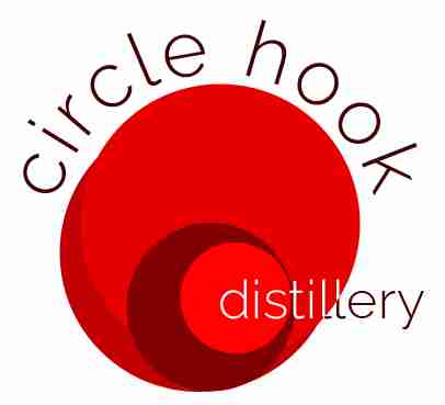
Pretty cool right? Only problem is, we totally forgot about their desire to portray a “coastal” feel. So many months had passed between our initial meeting and the actual design of this logo, and, since we were so excited to get to work on this logo, we just forgot that aspect altogether. The clients liked the design but felt it portrayed more of a modern/urban feel as opposed to the coastal feel they were looking for. Looking at the logo, we really had no choice but to agree. Oh well, chalk that one up to experience.
The Second Draft
Ok, so back to the drawing board…literally. I have to admit, we exercised a bit of tunnel vision when designing the first draft. Because of this, we had to take a minute, regroup and refocus. Ok, coastal, no problem. Jaimee Designs Web Studio is located on the Gulf Coast of Mississippi so this should be easy, right. Well, sort of. Coastal can mean many things; sun, water, palm trees, birds, boats, seafood, Barq’s Root Beer. There are dozens of items that can elicit a coastal feel, so which one or ones should we use for this logo? Well, we decided to keep it simple and go with the first thing that came to mind, water and sun. However, we wanted to keep the use of circles and the circle hook.
Continuing with our use of the Golden Ratio, we came up with several new versions of a logo that more directly portrayed coastal imagery. One such version utilized a circle broken into two halves and separated by the Circle Hook name. The top half was colored a rich orange and broken apart by a smaller circle, representing the sun, and several rays shooting out from the sun into the distance. The bottom half of the circle was painted a deep blue and broken apart by several white lines increasing in distance from one another. The business name itself was in a bold font with a rough sponge-like effect which we felt represented a driftwood type of feel. The effect was pretty distinct and one we felt definitely portrayed a coastal feel. With this particular design, we decided to leave the actual hook out of it at first as the design itself didn’t really offer a great place to incorporate it.
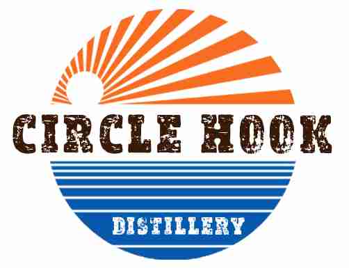
Feedback from this draft was much better. Since this time we had actually provided the client what they had asked for (sheesh). They loved the new direction this was going but felt the logo was a bit busy. Additionally, Amy made the comment that the sky reminded her of the Japanese rising sun. Yep, you can definitely see that! She also didn’t care for the sponge-like effect in the text. We got on a phone call with the clients so we could discuss next steps. Ultimately, they loved the direction this logo was going, they just wanted to simplify it a bit and incorporate the actual hook into the design somehow.
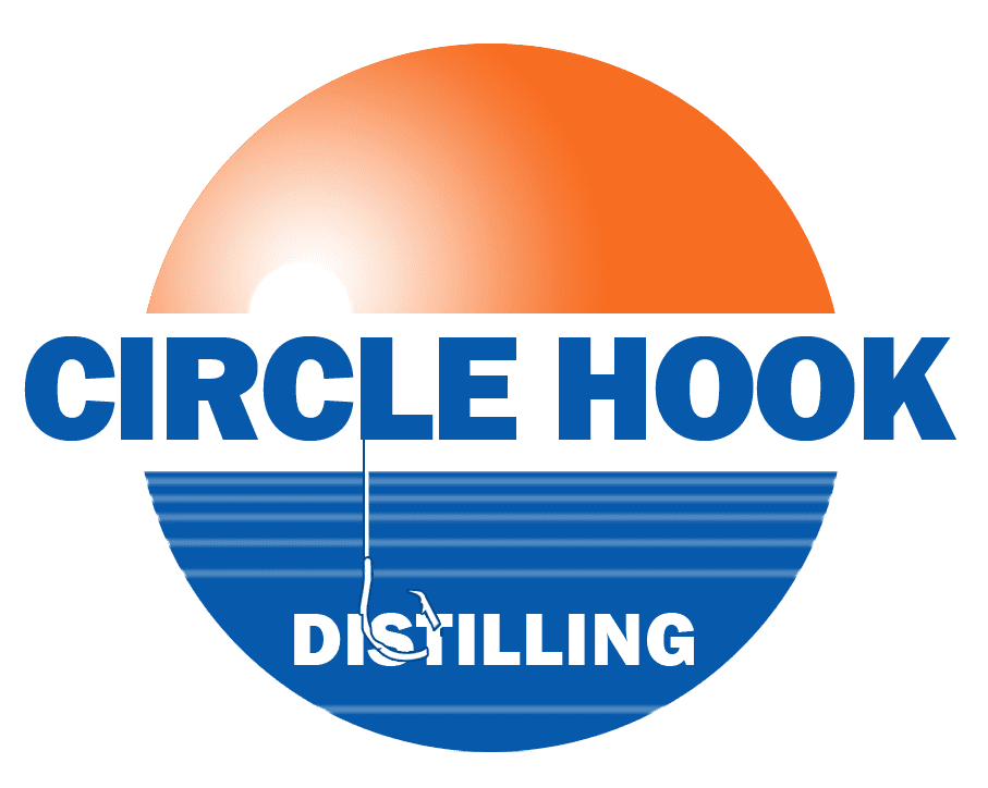
The Third Draft (and final Logo Design)
So for the third draft, we played around a lot with the sky in an attempt to simplify the design yet keep the feel we have achieved. We placed a lighter shade of both orange and blue behind the sky and water in an attempt to subdue the stark contrast of the white. That helped quite a bit but something still wasn’t quite right with the sky. It still looked like the Japanese rising sun just not so obvious. And the hook…forget it. We were stuck on that one so we procrastinated on that in favor of other items. Changing the font was fairly straightforward and the clients had told us over the phone that they would rather it say “Distilling” than “Distillery”.
The final result was achieved after several iterations of the sky and some grand insight by my wife who suggested to have a line coming down from the words “Circle Hook” with the hook on the end and actually hooking, or catching, the word Distilling. What a great idea! A quick side note here for you designers…never underestimate the power of ideas from non-designers. Sometimes they have the absolute best ideas ever! So, with that offhand remark from my wife, we added a fishing line with the silhouette of a circle hook wrapping around the “S” and puncturing the “T” in Distilling thus “catching” the word. Brilliant! For the sky, we found that a simple white circle with a white gradient emanating out from within gave the best effect. Additionally, we changed the font color to a shade darker than the water.
So, what happened? The clients were ecstatic! This was exactly what they wanted and were more than excited. What’s most interesting about this is that Eli told me the hook coming down through the water and “hooking” the word Distilling is what sold him on this design. He said that was what he liked the most. Like I said, never underestimate the power of ideas from non-designers!
And Finally
So there you have it. The design process we used for the Circle Hook Distilling company’s logo. Actually, there is another logo that was created in the process that they loved as well, but for now, we’re going to keep that one under wraps. Some things we learned during this process is to try really really hard not to get tunnel vision and get so wrapped up in a design process that you forget to even check your meeting notes. Ugh! The Golden Ratio came in very handy with this design as did the Kuler Adobe Color app (which is always extremely helpful). We can’t wait for Circle Hook Distilling to go live and start producing their product (we especially can’t wait to see this logo out there in the world).
Resources Used
- Adobe Photoshop
- Adobe Illustrator
- Adobe Color App (Kuler)
- Golden Ratio Template
Do you have logo design or website needs, contact us here at Jaimee Designs Web Studio, LLC. We can help with digital and print media. From logo design to complete website makeover, we can help. Give us a call today!