

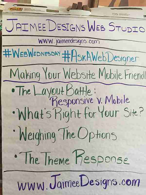
Making Your Website Mobile Friendly

 Google and Bing announced they are changing the way Websites are ranked and penalizing the sites that are not mobile friendly. To be compliant with this change, Websites must either change its site to either be responsive or to have a mobile design. Why did they decided to change the way Websites are ranked? Probably because 80% of Internet Users own smart phones.
Jaimee Designs wants to help you determine which option is right for you, to do this we’ve put together some tips on making a Website mobile friendly.
Making Your Website Mobile Friendly
- The Layout Battle: Responsive v. Mobile
Responsive layouts and mobile layouts should not be confused with each other. There is a huge difference between the two and quite a few pros and cons.
A responsive layout is one that is designed to be flexible, which means it doesn’t matter what size the screen is the design will condense itself to fit the information. The downside of a responsive theme is sometimes it can become distorted if you justify certain items. For example: if an image is justified left it won’t center correctly in the responsive design. Tables also look a little funky when in a responsive design. A way around this would be to use columns. The Jaimee Designs Website is a good example of a responsive design.
The mobile layout has its own separate style sheet and is designed specifically for mobile devices. The content on a mobile layout can also be different than what is displayed on the Website and offer information formulated for people on the go. A few mobile designs to check out: mgccf.org or gatorsigncompany.com.
- What’s Right for Your Site?
Determining which option is right for your site, requires you to look at your current site and make a choice. Do you have an html site or do you have a site resting on a content management system, like WordPress? In the event you have an html site, this may be a good opportunity to redesign the Website if it looks dull or adjust it using code to meet the standards. The standards and instruction on how to change your Website to be responsive or creating it’s own mobile stylesheet can be found at w3schools.com.
Do you have a site resting on a content management system with a template? Then there are a few options to consider: a responsive theme or a mobile plugin. Love your current theme but want to be in compliance then a plugin would be your best bet. However, it you are not married to your theme then you can choose to find another that is responsive. Themeforest.com is a great place to find a responsive theme.
- Weighing The Options
The options to make Websites compatible boil down to whether or not you want a responsive layout or a mobile plugin. Again, as mentioned above, a responsive design has it’s pros and cons. The pro is it is compatible with any size screen and the con is if not structured right could look a little strange on smaller devices.
The WordPress mobile plugin option allows the ability to just upload a plugin and within 10-minutes your site is mobile ready. One of our favorite mobile plugins for WordPress is WPTouch.
- The Theme Response
Choosing a responsive theme involves a little bit of planning to know what you are looking to achieve within it. At themeforest.com there is a search section where you can put in responsive and it will pull the most responsive themes available. Then you’ll have to look into the other features, not so much the images because they can be deceiving.
Well, there you go, a few tips to consider when looking into bringing your Website up to the search engine standards. However, if you think this is a little over your head or you would like to focus on other projects, Jaimee Designs is here to help you out. Contact us today about getting your Website mobile ready!