13 Of The Best Website Color Schemes (2022)

Are you overwhelmed by a million color scheme options and can’t seem to settle on one?
Color is an important aspect of web design and your chosen color scheme can make or break the look of your website.
Colors can have a huge impact on both appearance and brand consistency.
We’re going to show you 13 of our favorite website color schemes for use in your designs and example websites that use them!
Let’s dive right in!
Consider The Color Emotion Guide When Choosing a Color Scheme
We associate certain emotions with certain colors and it’s important to remember that when choosing your website’s color palette.
Take a look at this color emotion guide and you’ll get what we’re talking about.
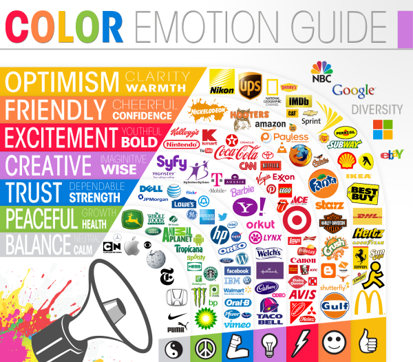
For example, the American Express logo utilizes the color blue to give off a sense of trust and strength.
They are a financial institute so giving people a sense of trust is crucial to their brand image.
Express VPN Website Color Scheme

Peaceful and clean
Teal #0f866c Navy #001d2f and Pink #fdf3f4
The use of teal provides the best of both worlds between green and blue and you can feel how the two emotions of trust and peace come together in their use of this specific color.
The navy is used a little less but provides a contrast to the white background of the web page.
The muted pink (or lavender blush as its truly called) gives the website a subtle pop.
This color scheme, or some variation of it, could be used on just about any site!
Mail Chimp Website Color Scheme

Bright and bold
Yellow #ffe01b and Teal #007c89
The bright yellow is definitely attention-grabbing. It’s bright yet warm and comforting.
The teal is a good choice for a call-to-action button and adds contrast to the bright yellow.
Goldune Website Color Scheme
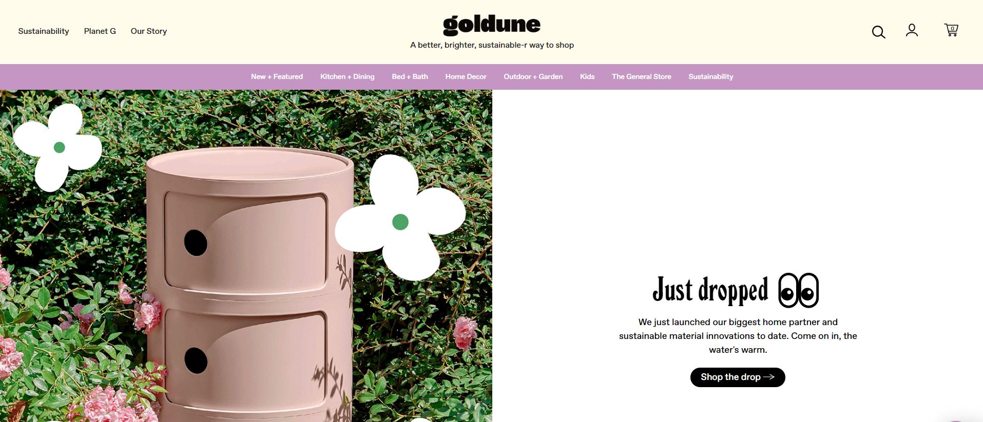
Fun and enticing
Floral white #fffceb and plum #c596c4
This muted color scheme gives off a simply floral feeling, which makes sense considering this shade of white is literally called floral white.
Pairing it with the plum color really gives off a peaceful vibe.
Martha Stoumen Website Color Scheme
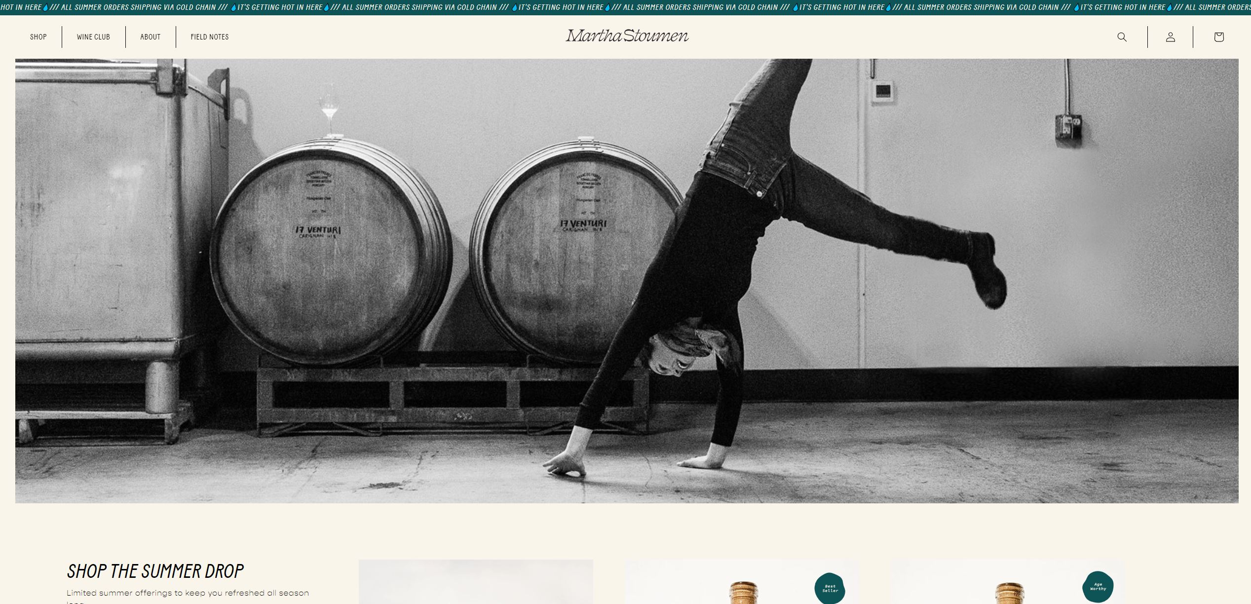
Woodsy and warm
Oldlace f9f5ea Darkslategrey 0e5356 and sienna a47250
The use of brown captures a sense of nature or agriculture.
Paired with the shade of white they blend very well together and the blue gives the perfect contrast between the two.
Greenlist App Website Color Scheme
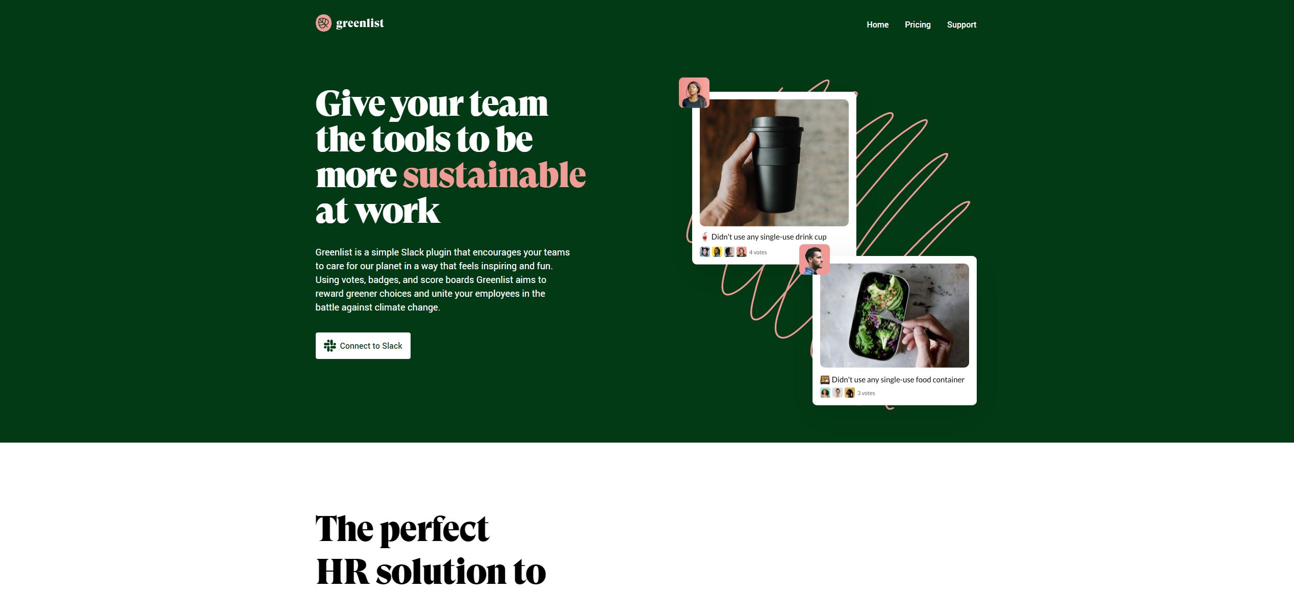
Wholistic and peaceful
Dark green 023a15 and dark salmon f09c96
It’s obvious that the color green would be used by a company with the color in its name and they definitely used it well.
This is a very simple color scheme that elicits a sense of health and peace. Which makes sense considering their aim is to reward greener choices in the battle against climate change!
HeTime Website Color Scheme
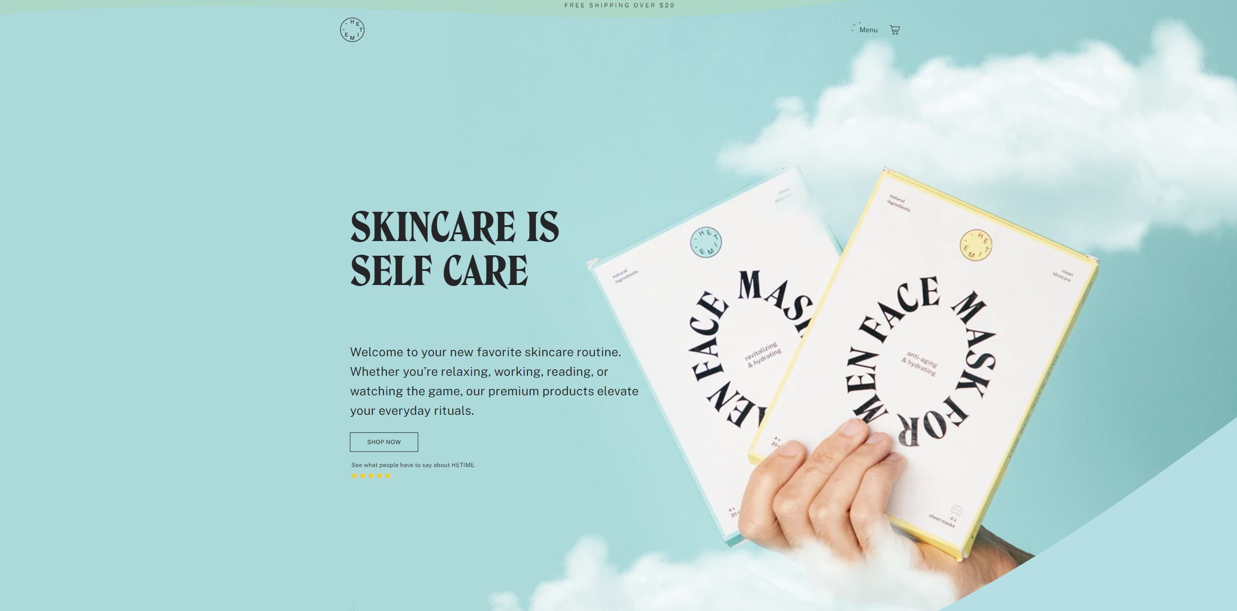
Imaginative and naturalistic
Lightblue acd9da and lightsteelblue add8c7
These two shades flow perfectly together. The lightblue is reminiscent of a blue sky and when paired with the light green, it gives off a very naturalistic feeling.
What a great color scheme!
Xenia Website Color Scheme

Enticing and vintage
Peru cc8328 darkslategray 0a3e52 and antiquewhite faebdb
While this particular shade is called Peru, the cuisine is Mediterranean.
It works well with the pink graphics and the blue is used just enough to be noticeable but not too overwhelming.
Judy Website Color Scheme

Cautious and secure
Orangered ff4a00 and black 000000
This is as simple as it gets! The use of orange and black elicits a sense of caution.
These are power outage and prep kit supplies so the use of these colors is appropriate.
When you want to stand out, a vibrant color like this shade of orange will do the trick.
EEN Nul Website Color Scheme
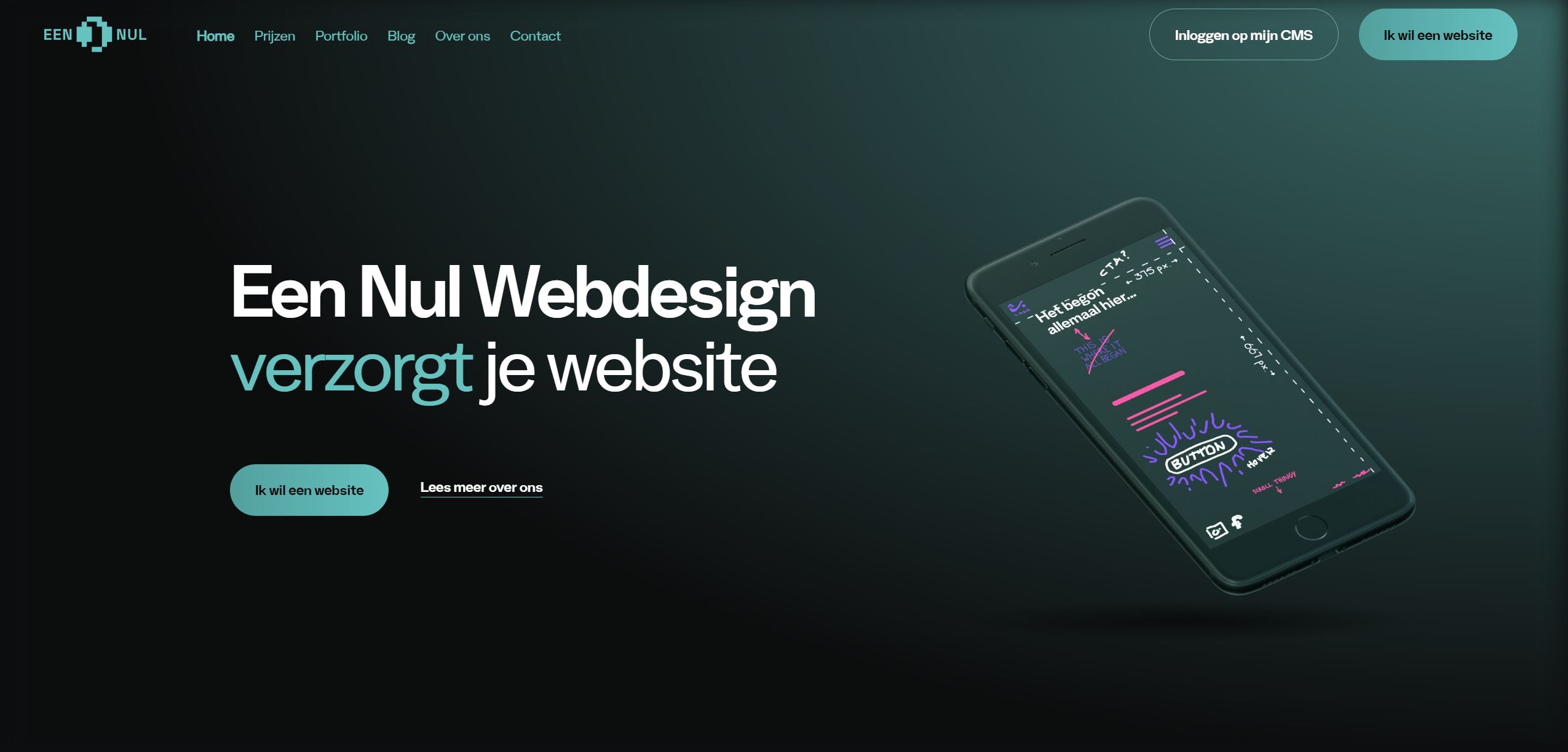
Futuristic and professional
Darkslategray 203635 and mediumaquamarine 61bab7
Darker navy colors are associated with professionalism and that is definitely the case on this website.
The dark grayblue gradient in the background provides a professional feeling.
A lot of colors could have worked for a call to action button in this particular color scheme, but this shade of blue was a great choice.
Mangrove Hotel Website Color Scheme
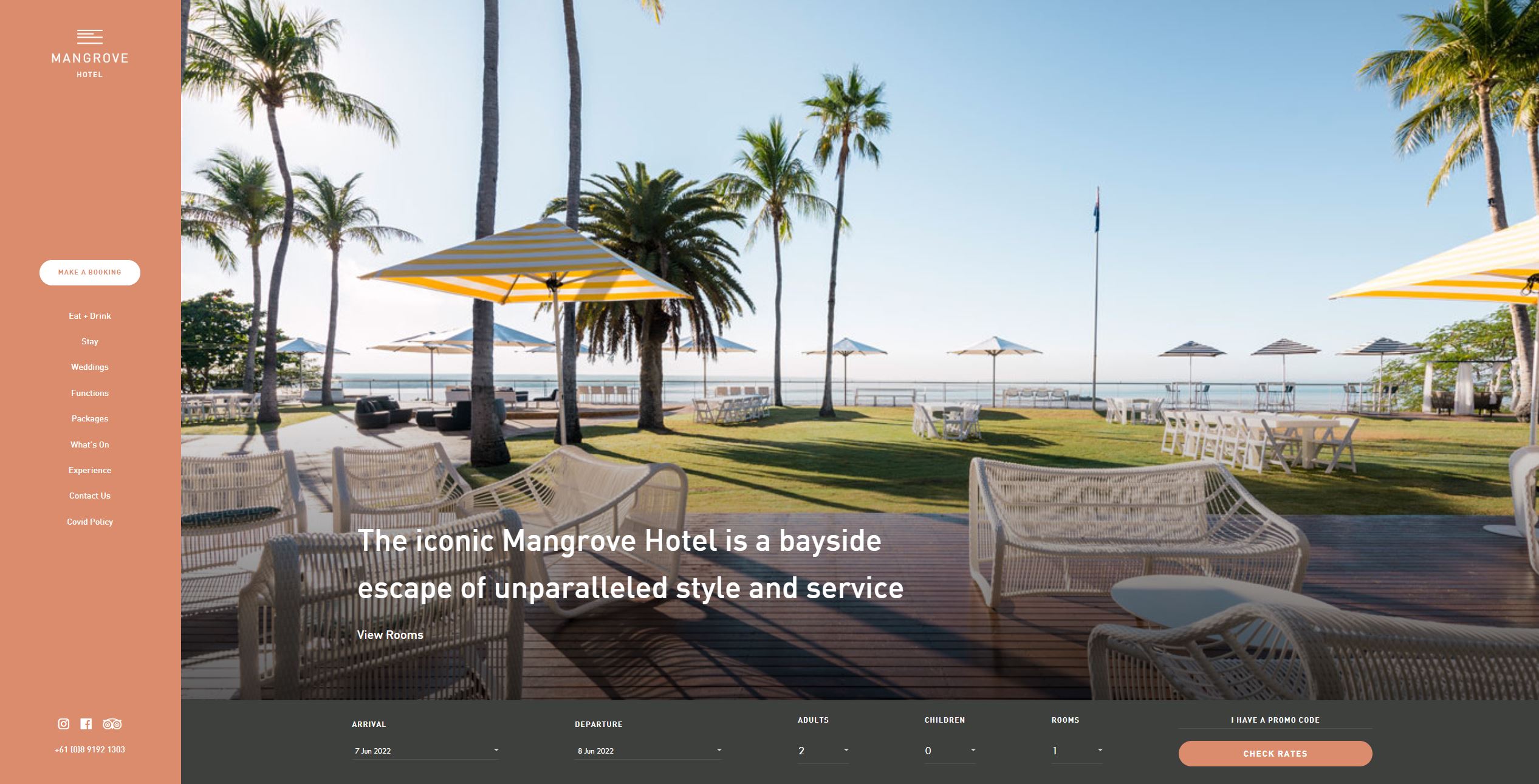
Peaceful and inviting
Darksalmon Db8c6c, white ffffff, and darkslategray 3d403c
There’s a place for bright and vivid colors and there’s a place for more muted colors.
Choosing a hotel’s color palette is important as it should be welcoming. This color scheme feels warm and inviting. Perfect for a hotel!
Great color scheme.
Igor Tech Website Color Scheme

Scientific and smart
Black 000000, white ffffff, and yellow fef003
Quite a simple color palette but utilized very well. No crazy shades or crazy colors, simply black, white, and yellow.
Simple yet professional.
Knapsack Creative Website Color Scheme

Trustworthy and creative
Sienna af4328, goldenrod cf9e2d, and white ffffff
These earthy tones blend perfectly together and add a nice contrast to the white background.
These colors appear warm and noble while not being too vivid.
Brattle Street Website Color Scheme

Bright and exciting
deepskyblue 00b8ec and khaki fee648
Another quite simple color scheme but what really catches our attention is the banana being blue and not actually yellow.
Which color scheme is for you?
We hope we made it a little easier for you to decide on a color scheme.
Find something you like and don’t overcomplicate it! You don’t need to be an expert!
These 13 color schemes are all great options you can choose from for your next design project.
What color scheme was your favorite? Let us know!