

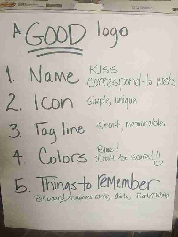
A Good Logo
 A logo is a very important item to think about when starting an awesome business. Logos are a company’s graphical representation and is the visible manifestation in all marketing and branding activities. On The @MrsJaimeeD #AskAWebDesigner Show we discussed 5 Aspects of “A Good Logo.” Here is the 5 things to keep in mind when developing “A Good Logo.”
- Name – KISS, Correspond to Web
What is in a name? Well when in comes to a business name a good thing to remember is to KISS, which means Keep It Simple Stupid. A simple business name makes it not only memorable but easy to spell. Also do a little searching on the Web to make sure you can have a good web domain name to correspond with your business name.Interesting Fact: Did you know most men who start businesses use their last name in the title and most women use their first name? We thought this was an interesting piece of information too. - Icon – Keep it Simple & Unique
Think about the major businesses out there, for example McDonalds, Apple, Windows, etc. When you think of any of these business, I bet you can see the icon that represents the corresponding businesses: golden arches of McDonalds, the bitten Apple, and the waving window. These companies kept the Icon of the businesses simple, unique, and placed more power in the design and not the color. On the show, the Queen of Code Jaimee Dorris, went through business cards she has received over the years and talked about the importance of an Icon in a Logo. Take a look at the Jaimee Design logo, it is simple, unique, and the color can change but the icon will remain the same. - Tagline – Short & Memorable
The tagline is a short and memorable description to sum up what your business is all about. On the Show we discussed a few tag lines, for instance Nike’s “Just Do It”, Jaimee Designs “Web Geeks with Personality, and Jaimee Dorris “More Courage than Common Sense.” - Colors – Blue! Don’t be Scared
Colors can evoke a feeling from consumers which is why many companies use the color blue because it is a calming color that also is associated with honesty. Blue may be popular but there are other colors in the crayon box that can attract consumers. Take a chance, try one out. Step outside the mold. - Things to Remember – Billboard, Business Cards, Shirts, and Black & White
The last and one of the most important things to think about when developing a logo is to make sure it will look good at any size, passes the transparency test, and looks great in black and white. Think of what the logo will look like on a huge billboard, on your business cards, and either embroidered or screen printed on shirts and hats. A good logo is legible on all mediums, but the best logos are the ones that can change in color but stay the same in design.
View the entire MeerKat stream below, and join us if you can every Wednesday for The @MrsJaimeeD #AskAWebDesigner Show live from Bay St. Louis, Mississippi.